

 |
| Photo thanks to Seattle Municipal Archives |
As this blog has grown it has become more and more difficult to easily find these, which are published about once a month. This is a shame as these are often the most useful and popular posts. There is now a direct link to this page from all areas of my site, on the sidebar.
As part of my continuous learning I go in-depth on a topic that interests me at the time and write up what I have learned. For me this is a way of consolidating the knowledge for myself, putting it in one place that I can refer to again in the future, and sharing my findings. I am quite particular and go to some lengths to get the information right, so I trust it will be of good use to more people than just myself. Each article also contains links to the most useful resources I have found during my investigations.
This post is part of an annual blog feature over at The Altered Page called 'Buried Treasure'. There you will find links to unearth the top posts on many art blogs.
This post is part of an annual blog feature over at The Altered Page called 'Buried Treasure'. There you will find links to unearth the top posts on many art blogs.
Learn & enjoy and remember to check out my artworks on Flickr, and have an insider peek at my life as an artist on Facebook.
To use this page - First give the script that collects all the relevant posts a moment or two to load. It should be done by the time you get down to reading this sentence. If not, close your eyes, tap your heels together three times, and that should do the trick.
- There is a short preview of each post when you hover the cursor over the title.
- Titles are in alphabetical order, but you can click on the date column header, 'POST DATE', to sort in ascending or descending order.
- Click on a specific label (not the column header) to display only the posts tagged with that label ie. art techniques
- To go back to the full list, just click the column header, 'LABELS'.
If you want to do a plain search of this blog, use the Blogger search box which is at the very, very top of this page on the LHS, next to the B outlined in orange.
************
 |
| All the alkyd mediums compared |
Rather than wasting a lot of time working through one different jar of medium at a time to figure out which ones I might like or hate working with, I decided to be all
All these alkyd medium were tested on the same scrap of acrylic primed canvas at the same time. You can see the results altogether in the above photo. If you click on it you'll get a much larger version. The ambient temperature was around 16C, with no humidity to speak of. No paint was included, this is just the medium itself brushed on. The samples were left indoors in my studio, in the open but not in direct sunlight. I was wanting to know how fast these fast drying additives really are, how glossy or otherwise they may be, how thick or thin they are to work with and how much of a colour cast they have.
The price breakdown is partly for my memory, partly for your international curiosity and partly to remind my fellow artists to do material costing breakdowns for the health of your business if you don't already! Many of these mediums are available in larger quantities which works out far cheaper, per millilitre. This is their worst case scenario.
The testing was limited to the mediums I managed to obtain. For instance, would you believe there is only one Gamblin supplier in this entire country? Here in Australia, Art Spectrum (an Australian brand) and Windsor & Newton are available everywhere. Everything else requires a bit of hunting.
I am more than happy to add mediums to this list if you have personally tested them. I am well aware that this is but a small sample of what's out there.
| Medium | Notes |
Archival Fat Medium | 4 hours drying time Somewhat glossy Very yellow, almost orange Consistency of oil $6.50 for 100ml = 6.5c/ml  |
Art Spectrum Liquol | 1 hour drying time Very matte Quite yellow Consistency of turps $12.15 for 100ml = 12.2c/ml  |
Art Spectrum Glazing Gel | 1-1.5 hours drying time Very glossy Quite yellow Thin thixotropic gel $16.99 for 150ml = 11.3c/ml  |
Gamblin Galkyd | 4 hours drying time, plus very, very tacky from about 1 hour Very glossy Quite yellow Consistency of thickened oil $27.45 for 237ml = 11.6c/ml  |
Windsor & Newton Liquin | nearly 4 hours drying time Very matte Somewhat yellow Thin gel $12.99 for 75ml = 17.3c/ml  |
Sennelier Flow & Dry | 4 hours drying time Somewhat matte Somewhat yellow Thin gel $11.39 for 75ml = 15.2c/ml  |
Lukas Medium 3 | 1 hour drying time Very glossy Perfectly clear Consistency of turps $11.35 for 50ml = 22.7c/ml  |
More art technique articles
 This article is one in an ongoing series of technical articles for artists, all archived together and accessible from here. The topics range from details on materials, to the business of art, to specific art techniques. Please make use of this resource.
And remember to check out my artworks on Flickr, and have an insider peek at my life as an artist on Facebook.
Wine, food and painting go together rather well, even if I am a little biased. The Barossa Fine Art Exhibition is part of The Barossa Vintage Festival 2011. It is a painting competition/prize based in the famous Barossa valley wine region in South Australia.
The competition powers-that-be have a stated interest in the 'diversity of contemporary abstracts'. As you know, I have a tendency toward creating abstract paintings and I'm hoping one of my foodie inspired abstracts might be a better-than-crapshoot chance in this competition and catch the eye of the judges from this food and wine region. But which painting?
This is where you can help. I have a hunch which one to send in, but as this whole idea of entering art competitions is new to me, I would love some external opinions. Maybe you and the judges will agree!
So bearing in mind that there will be no information other than the title and artist name to accompany the painting (just like in the poll below), which of these works best captures the spirit of its title?
Two clicks. One on your vote, one to submit your choice. That's it! Along with a heartfelt thank you :)
I'll let you know which one ends up flying my flag.
 |
| Photo thanks to Anita Thomhave Simonsen |
Size, primer and gesso. If you're anything like me, you're probably as confused as *** when it comes to these and preparing a surface for painting. Not any more. This post aims to clean away the mud and is a companion post to the one last month on painting substrates. So if you want to know what substrate is usable and whether it requires sizing or priming or both, check it out. This one is about the actual size and primer options. And some of it is straight from the wonderful AMIEN forums. Go check them out for all your technical artist materials questions.
Why Size?
Okay, here we go. Raw canvas, or any oil painting substrate, requires a barrier between itself and the oil paint. This is to prevent the paint sinking in to the surface (makes for terrible colour) and also to prevent the oils in the paint attacking and rotting the substrate (a nasty habit of oil paints).
In the case of acrylic paints, a barrier between the paint and substrate is required to prevent Support Induced Discoloration (SID) which is something that occurs in acrylic paints and mediums only. Many common artist supports have impurities that can discolor a translucent acrylic gel layer or color glaze, and a barrier must be applied to ensure the products stay clear as the films dry.
As an acrylic paint film cures, the water exits two ways: through the surface of the paint and through the back of the support, if it is porous enough. Canvas, linen, wood and masonite are all porous enough to allow water to absorb into them. During this drying process, the water is actually in equilibrium moving back and forth between the acrylic paint and the support. The water extracts water-soluble impurities such as dirt, sap, starches, etc., from the support and deposits them into the acrylic film. The result is a discolored (typically amber) film, with the degree of discoloration dependent on the amount of contaminants deposited and the inherent level of inpurities in the support.
SID contamination often goes undetected. In most cases, the paints applied contain a sufficient level of pigment, thus a strong enough color, to conceal the yellowing. However, in a transparent glaze and especially in thick translucent gel layers, SID becomes quite noticeable. SID can transform the appearance of an Ultramarine Blue glaze into a lower chroma, greenish color. Gesso alone will not stop SID, and different gels and mediums have varying degrees of blocking capabilities.
The acrylic dispersion mediums, paints and primers do absorb and expell moisture for about a year after they are applied -- or less time if the environment is warm and dry. After that's finished the resins coalesce into a more continuous film. They are still susceptible to moisture penetration, but not to the degree that puts them at the same risk as RSG. And it's preventable by coating the finished paintings.
In summary, for both oil and acrylic paints, it is wise to put a barrier between the paint and it's substrate. This barrier is known as size. It is meant to be a penetrating sealer, not a coating. It is therefore very thin, using it is good practice, and it's very easy to do.
Ancient and Modern Size
Traditional size for oil paints is a (disgusting I say) concoction of rabbit skin collagin heated with water. Although this has been used for hundreds of years it is know known by conservators to cause more problems than it solves. How? RSG is hygroscopic. It continuously absorbs moisture from the atmosphere, causing it to continuously swell and shrink. Over time, this constant flexing causes the oil paint on top, which is quite brittle, to crack. In fact, RSG is now believed to be the main cause of cracking in old oil paintings.
Instead of RSG underneath oil paintings, it is now recommended to use a pH neutral PVA or any acrylic medium whose manufacturer recommends it as a size. Please remember that PVA size or acrylic medium does not tighten fabric like rabbit skin glue.
Underneath acrylic paints, the best choice is acrylic medium whose manufacturer recommends it as a size that can block SID - a blocking size. A blocking size will be formulated to inhibit the migration of soluble organic materials from the support through to the ground. Two that are often mentioned are Gamblin’s PVA size and Golden Acrylics’ GAC100. Liquitex makes one as well, as I am sure others do too.
Two coats of size on the front of a substrate are sufficient. They should be touch dry and not cold to touch (which indicates moisture) before the next layer is added.
Why Prime?
Priming is the adding of an absorbent coating to a substrate. The aim is to provide the paint with a porous surface to adhere to. Primer is also known as ground or gesso. It is not size and will not seal or create a barrier to the paint. It does exactly the opposite. It is absorbent and provides tooth, or texture for the paint. It also tends to stiffen the substrate.
Usually two coats of primer is used.
Just for the record, you don't need to prime unless you want the surface that priming gives. You can paint directly onto modern size (but not RSG).
All About Gesso
Traditional gesso
Real or traditional gesso is for hard inflexible surfaces only. It is too brittle for canvas and will crack. Real gesso is like a plaster and is ideal on wood panels. It is made from a thin base of RSG and inert white pigments. The pigment is powdered chalk, calcium or gypsum. Sometimes titanium white pigment is also added to the mix for brightness.
This zinc oxide in the ground is a problem in terms of archival quality. Paint over zinc oxide and within a few years time the painting is likely to be delaminating or cracking.
Modern gesso
Gesso changed in the 20th century. In 1955, Liquitex, an acrylic paint company developed the first water-based acrylic gesso. It provided a consistent and inexpensive primer layer for both acrylic and oil paintings. Technically it is an acrylic dispersion primer, not a gesso, but it is mostly known as acrylic gesso or acrlyic primer. This is the only choice of primer available for use under acrylic paints.
Oil gesso
It's really useful to remember that an oil-primed canvas can only accept oil paints. Although oil paint can be applied to acrylic gesso, acrylic paint will not permanently adhere to an oil-primed canvas. The acrylic gesso will eventually peel off the oil-primed canvas.
Today there are two alternatives to traditional gesso with it's RSG content. There are oil/alkyd grounds which are the quickest drying option. And there is lead white oil primer. The latter is somewhat hazerdous to use. Don't smoke or eat in your studio. Use a barrier cream on your hands or wear thin rubber gloves so the lead can't penetrate your skin. Use odorless mineral spirits to thin the primer, not gum turpentine; odorless mineral spirits is hazardous but not as hazardous as regular mineral spirits and definitely not as hazardous as gum turpentine. In any event, you will want good ventilation when using these solvents: at least work near an exhaust fan. Thoroughly wash your hands when you are finished.
For the lead white oil primer you will have to apply at least 2 thinned coats. Allow perhaps a week for the drying of the initial coating, depending on the temperature and humidity of your studio. If it is dry to the touch after a few days, then you can go ahead and apply the second coat. After you apply the second coat, check to see that the coverage is good. You might want a third coat.
So there are three choices for priming for oil paints. Acrylic gesso and two kinds of oil based gesso.
Acrylic grounds under oils
In recent years, some artists have begun to question whether or not acrylic gesso is the right product to use under oil paint. Acrylic dispersion grounds retain their flexibility as they age, and the oil/alkyd grounds get stiffer and more brittle as they age. There is concern that this difference in flexibility may cause oil paintings on acrylic grounds to delaminte as they age.
The best current knowledge is that they are considered very good grounds for oil paints, with two caveats. 1.) You must purchase the highest quality ground you can find. That means: do not by acrylic dispersion grounds by price, and be sure the label tells you what's in the stuff. If you're unsure about the latter, call the manufacturer. 2.) Oil paints ought to be painted on rigid substrates. If the acrylic dispersion ground is applied to a panel, or to a fabric mounted on a panel, there should be no problems.
For a better bond with oil paint, after the acrylic primer is dry (when it's no longer cool to the touch is a good indicator) you should wipe this surface down with warm water and a clean rag to remove surfactants and allow to dry again (24-48 hrs) before applying oil based paints.
Linky Goodness
More art technique articles
This article is one in an ongoing series of technical articles for artists, all archived together and accessible from here. The topics range from details on materials, to the business of art, to specific art techniques. Please make use of this resource.
And remember to check out my artworks on Flickr, and have an insider peek at my life as an artist on Facebook.
 I have lately read a few different versions of this underlying story. One allegedly involved Picasso (scroll down to Cost of perfection). Another is a story about an artist who is heckled painting live. This story is based in Japan and reproduced from my local-until-last-year newspaper, The Advertiser, authored by Petrus Spronk. I clipped this out of the paper and kept it for about 2 years before deciding to type it up here this. And what do you know but Petrus turns out to be a well known local ceramicist who has an exhibition opening at the Ballarat Fine Art Gallery on Friday. How's that for a bit of synchronicity? I had no idea who he was when I first saw this article. It simply spoke to me:
Life can be seen as a path.
Along it we occasionally come across signposts.
These signposts appear in the form of people, books, films and experiences. You know it is a useful signpost when it changes your life's direction for the better.
Here is a signpost I found when, as an artist, I visited the world of otherness.
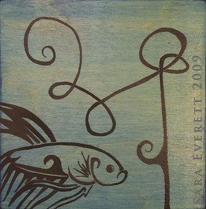
In Japan there once lived a famous painter, who was approached by a businessman who wanted a painting of a fish for his office.
The painter agreed and the businessman paid a large sum as a deposit.
After half a year the businessman contacted the painter and asked how the painting was developing. 'Not quite ready,' the painter replied.
Some time after, the painter rang the businessman to tell him the painting was ready.
When the businessman arrived, the painter chose a beautiful sheet of handmade paper.
He chose his brushes and prepared his paints.
Then with a few strong and deliberate strokes he painted the most beautiful image of a fish. Exquisite.
The businessman was amazed and surprised.
Why, he wanted to know, did he have to wait so long and pay so much money for something that took so little time and effort to create?
The answer, the painter told him, would be found in the large cupboard in the corner of the studio.
When the businessman opened the cupboard, thousands of practice paintings of fish fell out.
Image courtesy of Sara Everett
 |
| Thanks to Cara B Anderson for the photo. |
Rolled and Stretched and Primed
Canvas for artists is generally available in three forms. Stretched (and primed), unstretched and primed and unstretched and unprimed.
Naturally the form that saves an artist the most time is also the most expensive as all the preparation work has been done. I am talking here about the prestretched and preprimed canvases. There is nothing to do but take any wrapping off and get to being creative. This is a time saver that is not to be underestimated. The down side of ready to go canvas is that you have to take what's on offer. Which is not necessarily so bad. However, if you are after a non standard size or are particular about the weight of canvas on which you work or fussy about the gesso used and the surface finish you like to paint on, then the small number of options of prestretched canvas will probably drive you nuts.
So on to unstretched canvas. This is usually priced per length from a roll and cut when you buy. There is a lot more choice with this form of canvas, but some preparation work before painting.
Unstretched canvas does not have to be stretched onto a frame, but that is the conventional way. It is perfectly possible to work on canvas as you do a piece of paper. The stretching is to give a nice flat and smooth surface to paint on. Most painters like the bounce or give in a canvas stretched on a frame. I'm not going to give a how to on stretching canvas right here, but just say that if you buy canvas off a roll, you are more than likely going to stretch it onto a frame yourself. That takes time, of course. But you can make the frame any crazy size you want.
Canvas bought from a roll comes in two forms. Primed and unprimed. Primed means that once you've managed the stretching, you can get right to painting. Probably a good choice for an unusual sized frame where you're not too fussy about the gesso primer and the finish of the surface you paint on. Although it is certainly possible to reprime and/or sand a preprimed canvas to your heart's content.
The most labour intensive, for the artist, is to use unprimed unstretched canvas. Here you will be both stretching and priming your painting surface. If you are super particular about your painting surface, this one's for you. Though be warned, you will spend about half your 'painting time' in stretching and priming. But you will be able to get *exactly* what you want.
But There's Canvas and There's Canvas
That was meant to be a quick rundown on the forms that art canvas comes in. There is also variation in the actual canvas itself.
Jute or hessian
Jute or hessian is dirt cheap, has a very rough and open weaved texture and quickly weakens and becomes brittle with age. Not recommended for longevity! But what a texture.
Synthetic canvas
There are synthetic canvases usually made from polyester. Photo or giclee printing onto canvas tends to use synthetic canvases. They tend to have a much more even, tight weave which lacks character. Or bestows supreme consistency, depending on your taste. They are said (by the manufacturers) to stand up much better than cotton and linen when exposed to the elements and to be immune to bacteria, mildew and air pollution. Professional art supply stores call synthetic canvas 'cheap' (which is quite an advantage, I think) and tend to take a sneering tone toward it. I have not managed to turn up any unbiased information on it's artistic archival properties (ie, how it reacts over time to gesso and paint), however the tent and boating industries sing the praises of synthetic canvas, citing it's longevity over traditional cotton canvas. And if it performs in those tough environments, the omens seem good to me. One to watch.
On blended yarns: "Blends of fibre (ie cotton/polyster or cotton/linen) should be avoided as the final product is usually unstable due to the different weights, strengths and characteristics of the two yarns. They are only suitable if the blend is in the thread, and exists in equal weight ratio in the warp and weft." Thanks.
Cotton duck
This is the one to go for if you are buying cotton canvas. It is more tightly woven than plain canvas. Cotton canvas is the most conventional surface for painting (oils and acrylics obviously). It's properties are well known and it's available everywhere. It is flexible, easy to stretch properly and not too expensive. For large paintings it is too flexible. Large being over a metre square.Linen
From the flax plant. Belgian is considered the best. If you are after absolute quality, this is the type of canvas to go for. Although linen is difficult to prime and stretch properly, it has the best archival properties. Because it has less flexibility than cotton, it expands and contracts less with changes in temperature and humidity. This means the paint on top has a much more stable surface and is far less likely to crack. And it's strong and stiff enough to support large paintings (over 1m square). Cotton fibres are short and flat (only 4 to 5cm long) whereas linen fibres are round and can range from 25 to 90cm in length. Many painters also like the uneven, natural texture of linen. Oh, and by the way, it's brown.How Much Does It Weigh and Why You Might Care
Just to be clear here, I'm talking about cotton and linen. The synthetic canvases are much stronger per weight, so these figures don't apply.
7-8 oz. Beware! Not good enough for long lasting art. Often used for prestretched canvases. Usually poor quality loose weave and not very stable or strong. Avoid.
10 oz. The world's most popular art canvas weight. Fine for small artworks or situations where there will be little strain on the canvas. The main thing to watch out for is that most cotton canvas of this weight is twice as strong in one direction than the other (2:1 weave). Which reduces its dimensional stability. Warp and weft threads should be of equal weight, strength and material. The ideal yarn is closely and tightly woven with a square (1:1 or 2:2) weave.
12-15 oz. The best weight for painting. Nice and strong. Now you know.
More art technique articles
This article is one in an ongoing series of technical articles for artists, all archived together and accessible from here. The topics range from details on materials, to the business of art, to specific art techniques. Please make use of this resource.
And remember to check out my artworks on Flickr, and have an insider peek at my life as an artist on Facebook.
A Certificate of Authenticity is a bit like an artwork's birth certificate, passport and quality guarantee all rolled into one.
A Certificate of Authenticity (COA) provides a lot of concrete detail about a piece, but by existing for a particular piece, it says even more. An artwork that has a COA is one that is made by a professional practicing artist, not an amateur. It is a piece that potentially has collectible value. The Certificate adds a tangible credibility to the work. It can help the work hold its value.
The COA is held to be an indirect promise of quality. Art pieces that have a COA have usually been made by an artist who cares about their work, it's longevity and their collectors. The piece is likely to have been created from the best materials available, be designed to last and been created by an expert. Back to the concrete details, the Certificate will provide all the information on the medium(s) of the piece needed for conservation that might otherwise be lost forever.
Certificates protect the artist and the buyer by helping to prove that an artwork is original. Cheap copies sold without an artist's knowledge or consent are unfortunately common. Without a COA attached to the original this situation makes it next to impossible for the buyer to be confident of the value of the piece or for the artist to maintain their credibility and their livelihood.
As an art collector you really must only buy contemporary pieces that are backed by a Certificate of Authenticity. This helps ensure that what you have bought at a premium is genuine and not counterfeit. As an artist, do yourself a favour, be professional, and supply a detailed and complete COA for your buyers investment security and your own career protection. They are very popular right now amongst contemporary artists, but there are a few pertinent points to bear in mind.
What Is a Certificate of Authenticity?
Essentially, a COA is a document, created by the artist or someone who is an expert on the artist, which accompanies an artwork and contains all the information a collector could need to verify if the piece of art is genuine. Certificates of Authenticity are common for art and software. With art, they provide some guarantee of genuineness if they are complete and authored by an expert on the artist. Most often the COA is a paper document, but there has been a recent move toward digital certificates. Both are acceptable providing they are complete.
How to get a COA
A certificate of authenticity should be provided at the time of sale. For all sales of all original art. In fact, it should BE the sales receipt, not a separate document. High end art dealers view sales receipts signed by reputable gallerists or the artist themselves as reliable proof of genuineness. They view with great skepticism the sort of 'added on' made-up certificate with a decorative border supplied with an artpiece. That is because anyone can produce this sort of 'document'.
So when you receive the artwork, you should also receive it's completed COA as part of the sale invoice. Do not be fobbed off with promises for the certificate to be posted later. Always check that the original art you are buying comes with a complete and valid COA . It is OK to ask to see a sample of the certificate before purchasing. No certificate? How do you have any peace of mind that what you are buying and paying a premium for, is genuine? Return the artwork and get a refund if the seller you are dealing with is not forthcoming with a valid COA at the time of sale. At the very least you should receive an invoice or receipt for your purchase, the more detailed, the better.
What an authentic Certificate of Authenticity should include
- It should be authored by the artist, or their publisher or dealer or agent and if the COA is authored by someone other than the artist, it should state who and what their relationship to the artist is and their full contact details.
- Name of the artist and preferably their location and contact details (and web address).
- Title of the artwork.
- Date of completion. There are various dates that can be included, depending on the medium involved. For paintings, the date of completion. For prints there is the date of completion of the original, the date of this print edition and the date of signing the print. These all help art historians and collectors to understand the timeline of the artist’s work.
- Medium. The materials used to create the artwork. For prints of an original artwork in another medium, both the medium of the original and the medium of the print should be listed. The exact materials used in creating the piece helps the collector to verify they have the authentic artwork, and greatly helps conservation decisions. This can include the paint or ink type, the printing device, the canvas or paper type, source and weight and any pertinent or known archival properties. Professional artists prefer to use professional grade materials and take pride providing a piece made for longevity.
- Description or preferably an image of the artwork.
- Artwork dimensions. This helps the buyer to check whether the art piece has been altered since it's completion. It also makes it easy for them to order a correctly sized frame.
- Signature of the artist.
- Copyright statement. The copyright holder should definitely be identified and possibly also the applicable law and any reproduction rights. It is possible that the work will be under a public license or only have some rights reserved. In this case, copying of the work may be permissible.
- Extras which can be included are additional information on the techniques used to create the image, further information about the subject matter of the artwork, artist’s comments on the piece and for photos, details such as where the shot was taken, the GPS benchmark, date, time of day and camera used.
For prints, there are quite a number of extra details that should be included:
- The number of this particular print within the edition and the edition size. ie 4/10 (print 4 of 10 prints)
- Whether the edition is an open edition (more prints can be produced at any time) or limited.
- The number of prints and proofs in the edition that are signed/numbered, signed only, and unsigned/unnumbered.
- Whether the edition is a restrike or posthumous edition.
- Whether the edition is part of a series of editions. eg artist proof, press proof, transfer, etc.
- The status of the plate or master. Is it destroyed or on file? If the master has been destroyed then the edition is truly limited.
- Name and location (and web address) of the Master printer / publisher.
- Signature of the printmaker
Certificates for art by really famous artists should include a few extra details on top of those mentioned already. ALL limited edition prints by well-known artists are documented in books called catalogues raisonne. If a catalogue raisonne exists for an artist, the corresponding catalogue number or entry for the work art in question MUST be noted on the certificate of authenticity. You can also expect to find the names of previous owners, names of dealers or galleries that have sold the art, and sometimes information about auctions where the art was sold and the reference books that list the artwork.
Caveats to beware of
Valid certificates of authenticity state that the artpiece is absolutely and unquestionably by the artist who has signed it. If the certificate has any conditional statements such as "in our considered opinion..." or "we believe that..." these should ring your alarm bells. These statements are warning you that the art may not be genuine.
A statement that a work of art is genuine is NOT valid unless made by the artist or a respected authority on the artist. That person's qualifications and contact details should be stated on the certificate and be easily verifiable. When the contact information on a COA is out of date, check with a current authority on the artist to find out if this old certificate is valid. They will know if the COA author was a legitimate authority.
A certificate with illegible or incomplete contact information for the certificate author is never acceptable. A certificate with only an unidentifiable signature is not valid.
It is worth noting that there is no currently official body or legal binding for COAs. Anyone can write one. That's why inspecting the Certificate of Authenticity before a purchase is so important. It allows the potential buyer to check the credentials of the certificate's author and the details of the document. Not all COAs are created equal, so if any of the information on the certificate doesn't add up, it's your risk.
Remember, ideally the COA should BE the sales receipt, not a separate document. High end art dealers view sales receipts signed by reputable gallerists or the artist themselves as reliable proof of genuineness. They view with great skepticism the sort of 'added on' made-up certificate with a decorative border supplied with an artpiece. That is because anyone can produce this sort of 'document'.
Hey, a bunch of Useful Links
Certificate samples:
More art technique articles
This article is one in an ongoing series of technical articles for artists, all archived together and accessible from here. The topics range from details on materials, to the business of art, to specific art techniques. Please make use of this resource.
And remember to check out my artworks on Flickr, and have an insider peek at my life as an artist on Facebook.
This here pic i s the first (successful) test done for the SoFoBoMo challenge. As it was done before the beginning of the challenge it's not included in the final tally of pictures, but I like it a lot so it's on the front cover.

s the first (successful) test done for the SoFoBoMo challenge. As it was done before the beginning of the challenge it's not included in the final tally of pictures, but I like it a lot so it's on the front cover.Yes, the book is finished. No the blog didn't get updated along the way. Another hard drive failure got in the way. And I discovered that shooting & uploading via iPhone was quite time consuming enough without trying to blog via the phone as well.
Not to mention iPhone battery life. OMFG!! Apple, you have some serious work to do in that department. The grand plan of shooting while out camping in the wilderness came crashing down after day one. No mains power. No spare battery available. Solio solar charger didn't work. Nowhere to purchase an in-car charger (that's since been rectified). Oh well. The creatures got made and the pics got done... When I returned home!!
So instead of 'blogging as I go' I'm blogging after the fact. The next few posts will be all about the found creatures, their locations and inspiration.
Isn't it wonderful being able to be creative while walking the dog through the bush?
 Might, radiance, prosperity, victory, wealth, plenty, augustness, readiness, creative action, intelligence, adornment, stability, obedience and taste. These are 14 qualities identified as the primary effects and signs of creative force from Ancient Egypt, taken from Joseph Campbell's Oriental Mythology. These refer to qualities the original world creating force was believed to have. These were qualities the revered god/s had. Qualities to aspire to.
I thought I'd contrast these with the qualities I see that Western mainstream society values highly in a person now. Here goes, in a roughly equivalent order. Power, youth, f-ability, competitiveness, monetary wealth, accumulation of possessions, extroversion, social intelligence, easy categorization and a finetuned fashion sense. Putting it like that makes it look as though there has only been a slight shift.
And just for fun, I thought I'd throw in the beliefs, values and characteristics of this new millennium's creative people (from http://en.wikipedia.org/wiki/Cultural_Creative). This new group of people value achievement, independence, non-conformity, internal locus of control, ambiguity, risk-taking and opportunity. Nothing about power, possessions or looks. Quite a change huh?
Here's a bit more on values:
Authenticity - actions must be consistent with words and beliefs
Engaged action and whole process learning; seeing the world as interwoven and connected
Idealism and activism
Globalism and ecology
The importance of women
And defining characteristics:
* love of nature and deep caring about its destruction
* strong awareness of the planet-wide issues (i.e. global warming, poverty, overpopulation, etc.) and a desire to see more action on them
* willingness to pay higher taxes or spend more money for goods if that money went to improving the environment
* heavy emphasis on the importance of developing and maintaining relationships
* heavy emphasis on the importance of helping others and developing their unique gifts
* volunteer with one or more good causes
* intense interest in spiritual and psychological development
* see spirituality as an importance aspect of life but worry about religious fundamentalism
* desire more equity for women in business, life and politics
* concern for the violence and abuse against women and children
* want politics and government to spend more money on education, community programs and the support of a more ecologically sustainable future
* are unhappy with the left and right in politics
* optimism towards the future
* want to be involved in creating a new and better way of life
* are concerned with big business and the means they use to generate profits, including destroying the environment and exploiting poorer countries
* unlikely to overspend or be in heavy debt
* dislike modern cultures emphasis on making it and success, on consuming and making money
* like people, places and things that are different or exotic
And just for fun, a quiz!!
http://quizfarm.com/quizzes/new/eddxii/what-is-your-world-view/
You Scored as Cultural Creative
Cultural Creatives are probably the newest group to enter this realm. You are a modern thinker who tends to shy away from organized religion but still feels as if there is something greater than ourselves. You are very spiritual, even if you are not religious. Life has a meaning outside of the rational.
| Cultural Creative | | 94% |
| Materialist | | 88% |
| Existentialist | | 75% |
| Postmodernist | | 75% |
| Idealist | | 69% |
| Modernist | | 56% |
| Fundamentalist | | 19% |
| Romanticist | | 13% |
 So let's talk about palettes for oil painting. I just had the joyful(!) experience of trying to clean my super-very paint-encrusted palette. So I was wondering, what else could I use? Off I went and found out.
It turns out that any non-absorbent surface will do as a palette (bye bye art supplies store, hello shed). Glass, clear perspex, wood, melamine, waxed paper, tin, hardboard, marble and cling wrap are all options.
Of course the traditional palette was made of wood. And to look after this properly, it should be coated with linseed oil and wiped dry before use. At the end of a session (note to self!) the palette should be cleaned with turps and scraped with a razor, then coated with linseed oil and wiped dry again.
The old masters swore by pear wood. Allegedly, brushes wear out at 1/3 the rate on pear wood compared to glass. The pear, being a hardwood, has tight pores, hence it doesn't grab at the hairs of your brushes. Hmmm. Not having tested this myself, I can't really say, except that the logic does not hold up (glass is smooth and so shouldn't grab at your brushes at all) and the person giving this advice was also selling high-end pearwood palettes. They may well be the best, but for another reason perhaps.
I came across a few interesting tips along the way:
Waxed paper or cling wrap are great if you have the throwaway mindset. Just cover your work area (even an entire table!), mix paints as you want, then scrunch and bin at the end of a session.
If paint is on a waterproof palette surface, the whole kaboodle can be put underwater. Why on earth? Because oil paints 'dry' by oxidation. Submerging the paint means that no air can get to it and it stays usable on the palette for weeks. Apparently. I might give that a test run some time. It's good to know.
Glass or clear perspex have the advantage of being transparent. This is great as you can match the background of your palette to the background or ground of your painting by putting a piece of coloured paper behind the palette. Why would you do this? To help you judge and mix tones accurately. The disadvantage of glass is that it tends to be greasy.
The new smooth surfaces such as glass or melamine-laminate are very easy to clean. A lot easier than wood which gets the paint stuck in the pores.
So it turns out that I didn't need to drive all the way into the nearest city to get myself a new 'art store' wooden palette after all. Although I did manage to clean the one I have with an hour, a lot of elbow grease, turps and a scourer, I could have just rolled out the waxed paper sitting in the kitchen drawer and got on with painting. Ah, next time.
And yes, that picture is my CLEAN palette :)
More art technique articles
This article is one in an ongoing series of technical articles for artists, all archived together and accessible from here. The topics range from details on materials, to the business of art, to specific art techniques. Please make use of this resource.
And remember to check out my artworks on Flickr, and have an insider peek at my life as an artist on Facebook.
Hello world indeed. This is the year of finishing things that have been started and it is also the year of the artist. I know I know, it’s February now and these new year declarations should already be firmly in place, or more likely, firmly shoved off the wagon. However, here goes regardless. Inspired by the plethora of ‘an artpiece a day’ sites and blogs, I’m doing my own version. And with a kick up the bum courtesy of my friend Laurel, I’m away. It won’t be an every day thang. Given that at the moment I don’t always have time to cook my dinner, let alone walk the dog, it shall be weekly. So there. A weekly piece of art. Most likely paintings or animations. And, ta-da, here’s number one…


